Building A Data-Driven Organizational Chart In Apps Script
Using OrgChart JavaScript Library In A Web App
Part of the Google Apps Script series
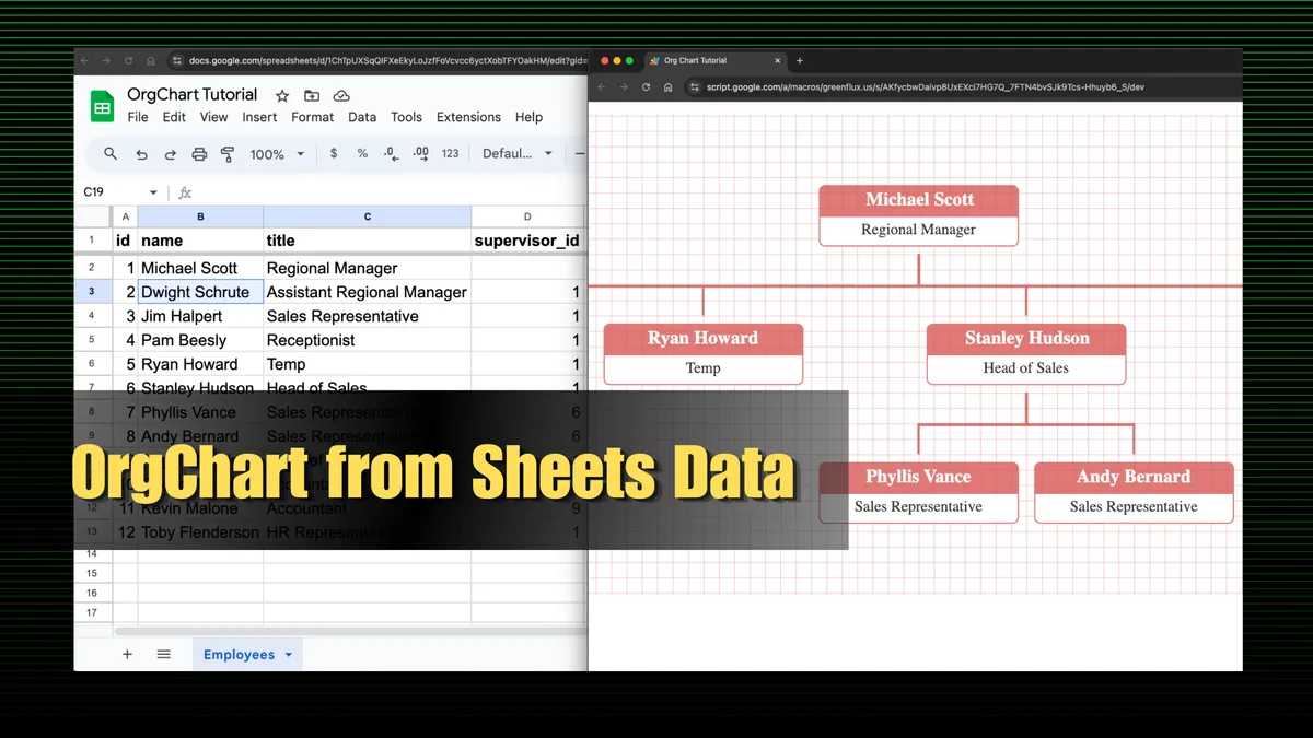
Organizational charts help visualize the reporting structure of a company in a tree-like graph. They are usually created with a design tool, and lots of manual data entry. Then, every time an employee changes, the graphic has to be updated again manually.
However, most organizations tend to have this same data in a database or spreadsheet format, with a column for the supervisor’s name or ID. And with a little JavaScript, this data can be used to create a data-driven org chart that updates itself when the data changes!
In this guide, I’ll show you how to build a data-driven organizational chart based on Google Sheets data, using Apps Script and the OrgChart JavaScript library.
This guide will cover:
-
Deploying Apps Script as a Web App
-
Using the OrgChart library
-
Transforming sheet data with JavaScript
-
Passing data from Sheets to OrgChart
Let’s get started!
Basic Apps Script Web App
Start out by opening Apps Script from the Extension menu of the sheet with your employee data. In this case I have a sheet with each employee’s id, and a column for supervisor_id.
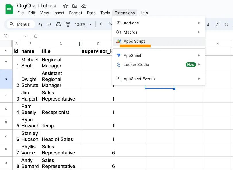
Add a new HTML file and name it index, then paste in this placeholder HTML doc:
<!DOCTYPE html>
<html>
  <head>
    <title>Org Chart Tutorial</title>
    <style>
      body {
        font-family: Arial, sans-serif;
        text-align: center;
        padding: 50px;
      }
      h1 {
        color: #333;
      }
      ul {
        list-style-type: none;
        padding: 0;
      }
      li {
        margin: 10px 0;
        font-size: 18px;
      }
    </style>
  </head>
  <body>
    <h1>Build a Data-Driven Organizational Chart</h1>
    <p>Learn how to create dynamic org charts with Google Sheets and Apps Script!</p>
    <ul>
      <li>Deploy Apps Script as a Web App</li>
      <li>Use the OrgChart Library</li>
      <li>Transform Sheet Data with JavaScript</li>
      <li>Connect Google Sheets to OrgChart</li>
    </ul>
  </body>
</html>
Then, in the Code.gs file, paste in this doGet() function to serve this HTML file as a web app:
function doGet(e) {
  return HtmlService.createHtmlOutputFromFile('index')
    .setTitle('Org Chart Tutorial')
    .setXFrameOptionsMode(HtmlService.XFrameOptionsMode.ALLOWALL);
}
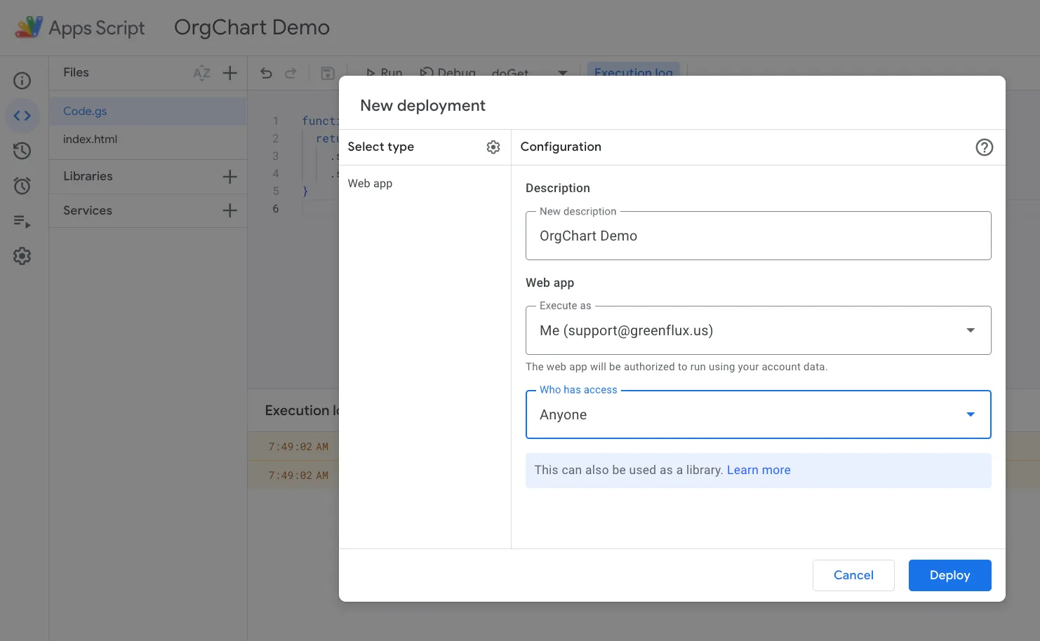
Now publish the script as a web app:
-
Save the script, and then give it a name
-
Click Deploy > New Deployment
-
Click the gear ⚙️ and select Web app
-
Name the deployment, and select Who can view:
anyone -
Deploy! 🚀
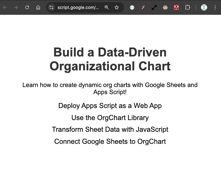
Open the deployment link, and you should see something like this:
Using the OrgChart Library
OrgChart is an open source library for creating data-driven organizational charts. It uses a nested JSON structure to feed the chart, with a tree-like schema that matches the visuals of the chart.
Here’s a sample of the data format taken from their docs:
{
      'name': 'Lao Lao',
      'title': 'general manager',
      'children': [
        { 'name': 'Bo Miao', 'title': 'department manager' },
        { 'name': 'Su Miao', 'title': 'department manager',
          'children': [
            { 'name': 'Tie Hua', 'title': 'senior engineer' },
            { 'name': 'Hei Hei', 'title': 'senior engineer',
              'children': [
                { 'name': 'Dan Dan', 'title': 'engineer' }
              ]
            },
            { 'name': 'Pang Pang', 'title': 'senior engineer' }
          ]
        },
        { 'name': 'Hong Miao', 'title': 'department manager' }
      ]
    }
…which renders as:
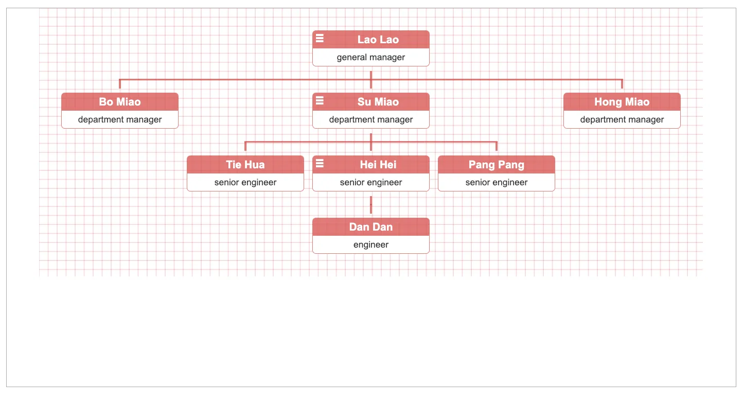
You can also add different css to each node, images, pan and zoom controls, collapsable nodes, and a ton of other features.

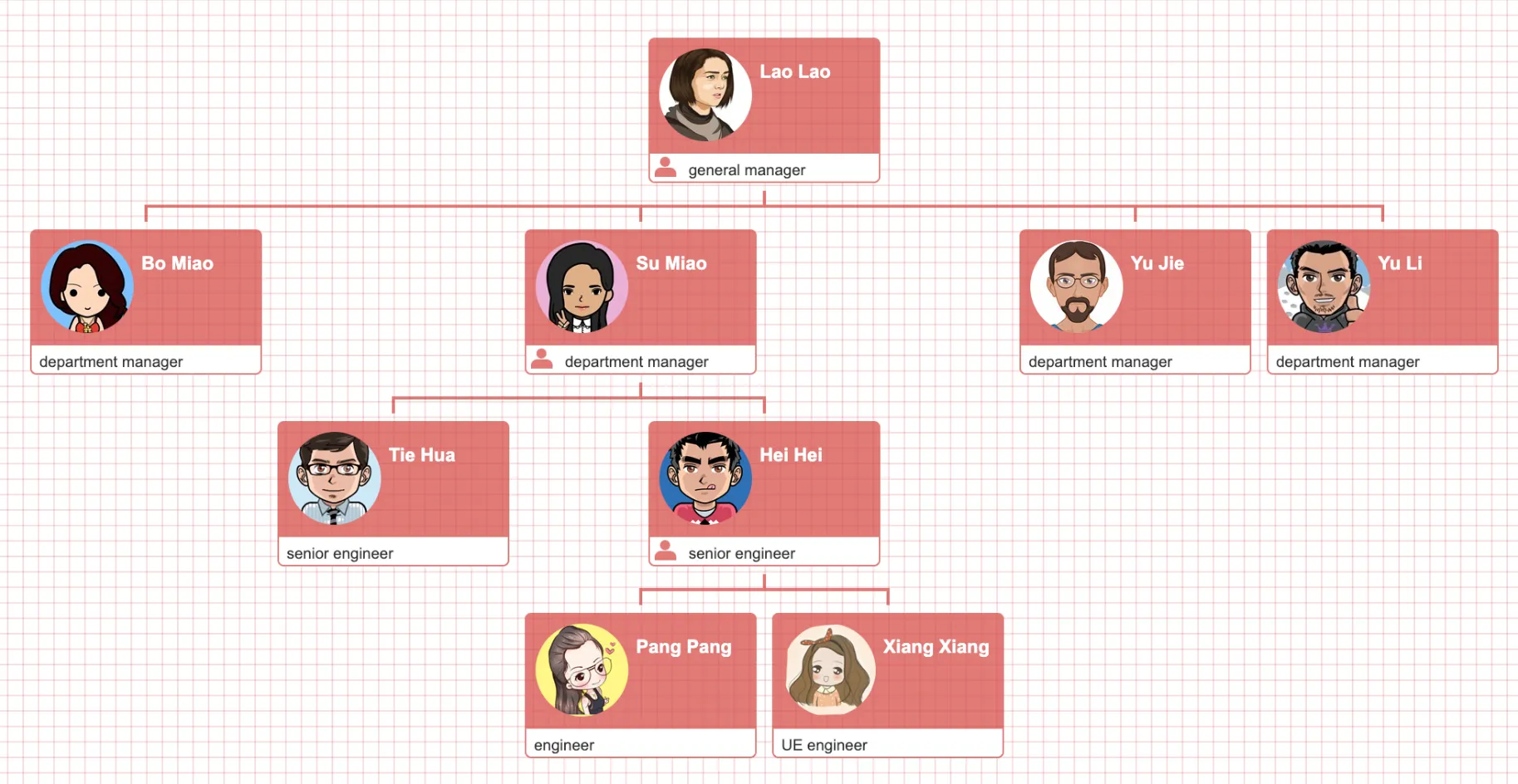
Let’s start with the most basic example.
Update the index.html file with this example from their docs:
<!DOCTYPE html>
<html lang="en">
<head>
  <meta charset="utf-8">
  <title>Organization Chart Plugin</title>
  <link rel="icon" href="https://cdn.jsdelivr.net/npm/@fortawesome/[email protected]/svgs/solid/sitemap.svg">
  <link rel="stylesheet" href="https://cdn.jsdelivr.net/npm/[email protected]/dist/css/jquery.orgchart.min.css">
  <style>
    #chart-container {
      width: 100%;
      height: auto;
      text-align: center;
    }
  </style>
</head>
<body>
  <div id="chart-container"></div>

  <script src="https://cdn.jsdelivr.net/npm/[email protected]/dist/jquery.min.js"></script>
  <script src="https://cdn.jsdelivr.net/npm/[email protected]/dist/js/jquery.orgchart.min.js"></script>
  <script type="text/javascript">
    $(function() {

      var datasource = {
        'name': 'Lao Lao',
        'title': 'general manager',
        'children': [
          { 'name': 'Bo Miao', 'title': 'department manager' },
          { 'name': 'Su Miao', 'title': 'department manager',
            'children': [
              { 'name': 'Tie Hua', 'title': 'senior engineer' },
              { 'name': 'Hei Hei', 'title': 'senior engineer',
                'children': [
                  { 'name': 'Dan Dan', 'title': 'engineer' }
                ]
              },
              { 'name': 'Pang Pang', 'title': 'senior engineer' }
            ]
          },
          { 'name': 'Hong Miao', 'title': 'department manager' }
        ]
      };

      $('#chart-container').orgchart({
        'data' : datasource,
        'nodeContent': 'title'
      });

    });
  </script>
</body>
</html>
Save the file, then click Deploy > Test Deployment. This will let you view the changes without having to redeploy each time. You should see a chart like this now.
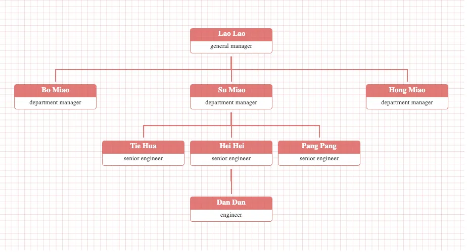
Transforming Sheet Data with JavaScript
Before we can send the sheet data to OrgChart, it has to be formatted in the correct, nested structure.
Start out by individually copy/pasting each name from your sheet into this JSON structure:
{
        'name': 'Lao Lao',
        'title': 'general manager',
        'children': [
          { 'name': 'Bo Miao', 'title': 'department manager' },
          { 'name': 'Su Miao', 'title': 'department manager',
            'children': [
              { 'name': 'Tie Hua', 'title': 'senior engineer' },
              { 'name': 'Hei Hei', 'title': 'senior engineer',
                'children': [
                  { 'name': 'Dan Dan', 'title': 'engineer' }
                ]
              },
              { 'name': 'Pang Pang', 'title': 'senior engineer' }
            ]
          },
          { 'name': 'Hong Miao', 'title': 'department manager' }
        ]
      }
Just kidding! DON’T do that. Hopefully you’re reading ahead, and didn’t just waste 10 minutes doing it the hard way. That would suck just as bad as manually updating the graphic each time! No, instead, we need a function that pulls data from the sheet and converts it to this format.
Add a getEmployeeData function to the Code.gs file, to build the JSON structure:
function getEmployeeData() {
  const ss = SpreadsheetApp.getActiveSpreadsheet();
  const sheet = ss.getSheetByName("Employees");
  const data = sheet.getDataRange().getValues();

  const employees = {};
  let root = null;

  // Skip header row
  for (let i = 1; i < data.length; i++) {
    const row = data[i];
    const id = String(row[0]);
    const name = row[1];
    const title = row[2];
    const supervisorId = String(row[3]) || '';

    employees[id] = {
      id: id,
      name: name,
      title: title,
      supervisorId: supervisorId,
      children: []
    };

    // Find the root (no supervisor_id)
    if (supervisorId === "") {
      root = employees[id];
    }
  }

  // Build the tree structure
  for (const id in employees) {
    const employee = employees[id];
    if (employee.supervisorId !== "" && employees[employee.supervisorId]) {
      employees[employee.supervisorId].children.push(employee);
    }
  }

  Logger.log(JSON.stringify(root));
  return root;
}
First we fetch the employee data as a 2D array, then iterate through it to build an employees object, where each employee is stored by their id. Then the hierarchical tree is constructed by iterating over the employees and using push() to append employees to their supervisor’s children array based on matching supervisor_id values.
This should return the correct, nested JSON structure for OrgChart.
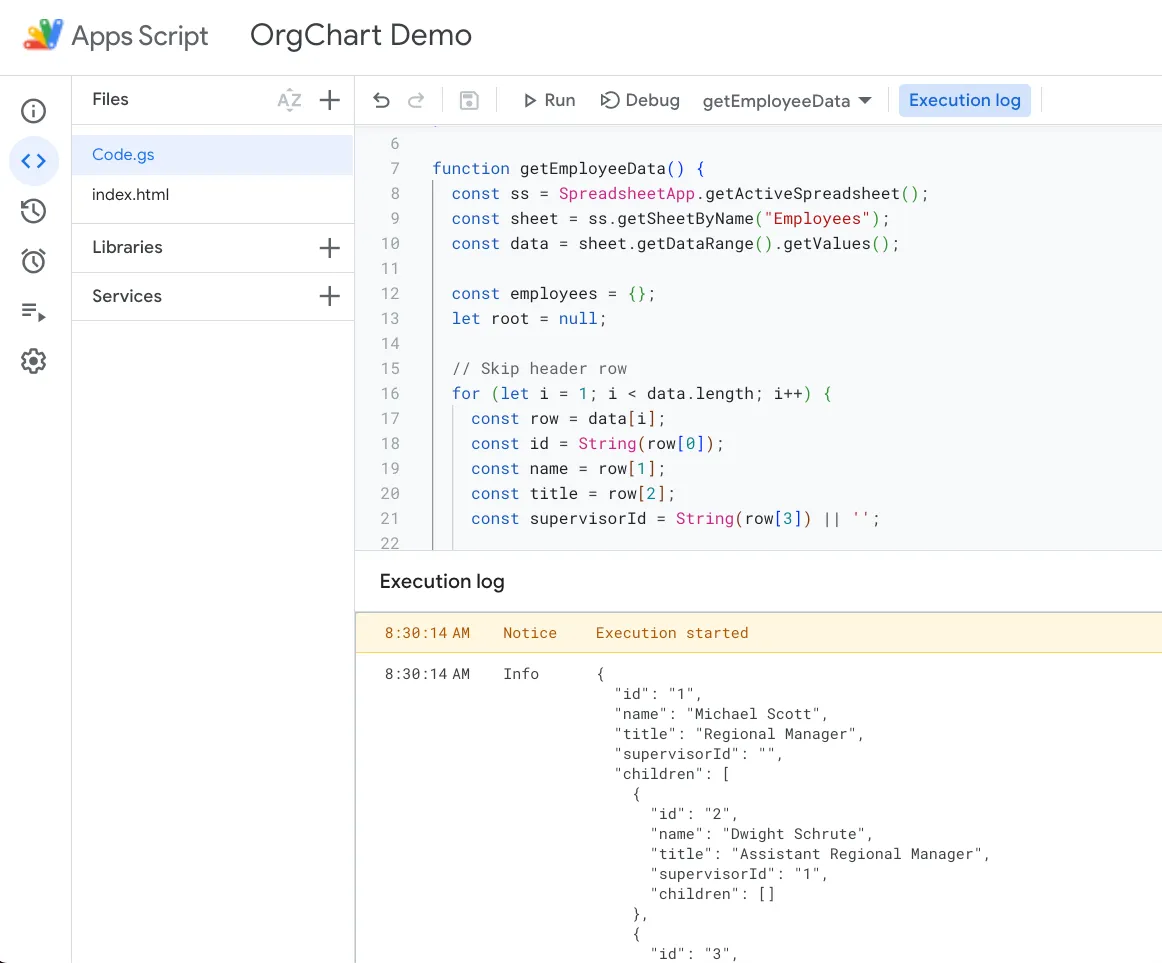
Copy the value from the logs, and paste it into the HTML doc, replacing the original chart dataset. Then Save, and refresh the Test Deployment page.
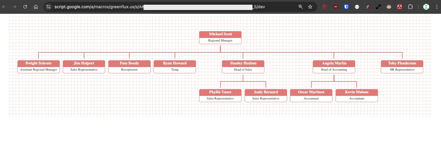
Ok, that’s pretty cool, but it won’t update when the sheet data changes.
Passing Data From Sheets To OrgChart
Now to tie it all together. We can use the getEmployeeData() function in the HTML doc to feed the chart by calling the withSuccessHandler() function. The syntax is a little weird but its easy once you get the hang of it. If you want to send the output of a server side function (.gs file) to a function on the client side (HTML file), then you pass the client function to withSuccessHandler(), and chain on the server function.
google.script.run.withSuccessHandler(clientScript).serverScript()It’s a little backwards, because you would think you need to run the server script first, then pass that value to the second script. But the way withSuceessHandler() works, is passing it the second (client/html doc) script, and then chaining on the first (server/.gs) script.
Update the HTML with:
  <script type="text/javascript">
    $(function() {
      // Call Apps Script function getEmployeeData and handle the response
      google.script.run.withSuccessHandler(function(datasource) {
        $('#chart-container').orgchart({
          'data' : datasource,
          'nodeContent': 'title'
        });
      }).getEmployeeData(); // Calls the Apps Script function
    });
  </script>
Click Save, and then update the deployment:
-
Deploy > Manage Deployments
-
Click Pencil icon ✏️ > Version dropdown > New Version
-
Name the new version
-
Click Deploy! 🚀
You should now have a data-drive organizational chart, showing live data from your Google Sheet!
Change the Regional Manager to your name in the sheet, then refresh the web app. You should now be at the top of the org chart. Congrats on the promotion! 🤝

Conclusion
Organizational Charts are useful for visualizing a reporting structure, but keeping them updated manually can be a lot of work. This work can be automated by building a data-driven chart using the OrgChart library in Apps Script, creating a data-driven chart that updates with your spreadsheet!
What’s Next?
OrgChart has tons of different options to customize the display and interactions, like adding pan and zoom features, or icons and extra css classes to add styling. You could also add click events to each node with a card view or navigate to the employee record in detail view.
Got an idea for other use cases? Drop a comment below!