Generating Heatmaps in Google Sheets using Apps Script and ECharts
Interactive Heatmap in under 100 lines of code!
Part of the Google Apps Script series
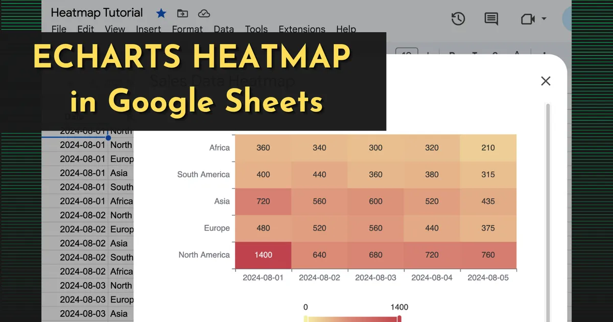
Heatmaps are a great way to visualize aggregate data so you can easily see trends and spikes in the data. They can summarize data across a range of time, display traffic and weather patterns, or any other series of data comparing two axis. One popular solution for creating Heatmaps, is the Echarts library from The Apache Software Foundation.
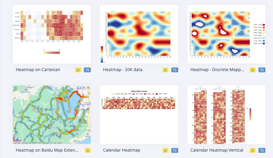
I’ve used Echarts in a few other platforms recently, and I wanted to see if I could get it working in Google Sheets. It was easy to get a sample chart with hard-coded data to display, but connecting the real sheet data was a bit challenging. So I wanted to share this guide now that I have it working.
This guide will cover:
-
Displaying a static EChart in a modal using Apps Script
-
Writing JavaScript to aggregate and transform sheet data
-
Inserting the sheet data into the HTML template using withSuccessHandler
ECharts Basics
ECharts works by selecting a DOM element, and running echarts.init(el) to create a chart instance. Then, the setOption(option) method is used to pass in the specific chart type and data.
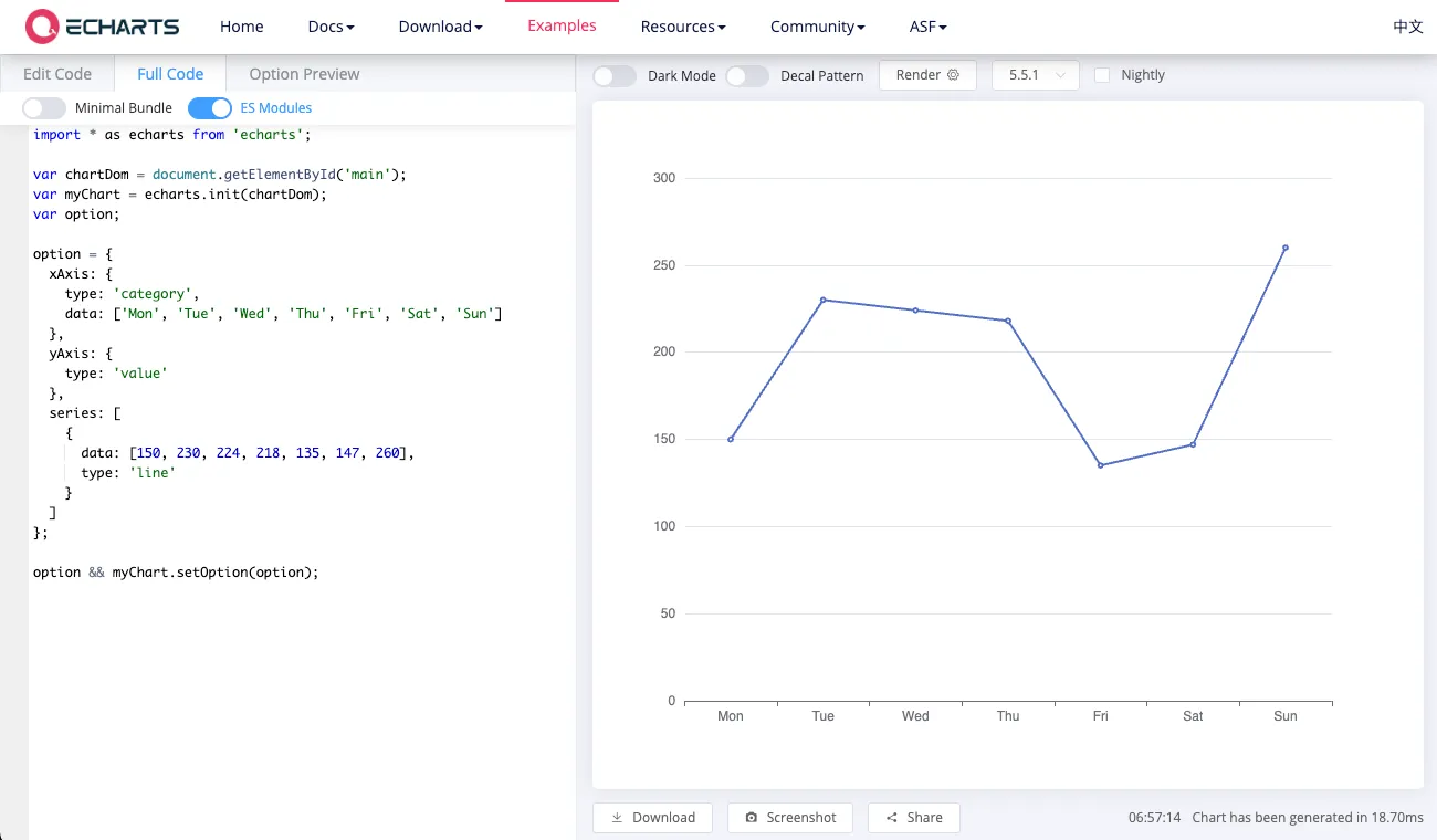
First we’ll try to get this example displaying in a modal using Apps Script. You can follow along by copying the sample Sales data used in this example, or modify the code for your column names.
Open Apps Scripts from the Extension menu in Google Sheets, and click the + to add a new file. Then select HTML and name it Heatmap.
Then paste in this code:
<!DOCTYPE html>
<html>
  <head>
    <script src="https://cdn.jsdelivr.net/npm/[email protected]/dist/echarts.min.js"></script>
  </head>
  <body>
    <div id="chart" style="width: 600px; height: 400px;"></div>
    <script>
      const chart = echarts.init(document.getElementById('chart'));
      const option = {
        xAxis: {
          type: 'category',
          data: ['Mon', 'Tue', 'Wed', 'Thu', 'Fri', 'Sat', 'Sun']
        },
        yAxis: {
          type: 'value'
        },
        series: [
          {
            data: [150, 230, 224, 218, 135, 147, 260],
            type: 'line'
          }
        ]
      };
      chart.setOption(option);
    </script>
  </body>
</html>
Next, paste this in the Code.gs file:
function createHeatmap() {
  const html = HtmlService.createHtmlOutputFromFile('Heatmap')
      .setWidth(600)
      .setHeight(400);
  SpreadsheetApp.getUi().showModalDialog(html, 'Sales Data Heatmap');
}
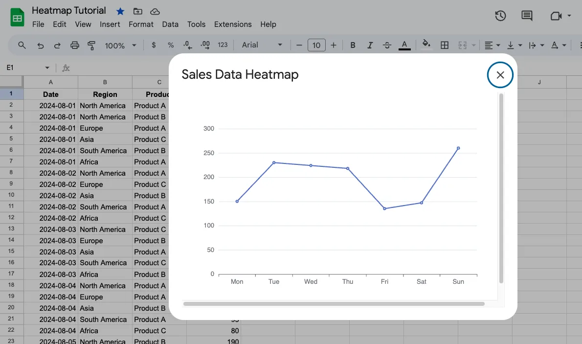
Click save, then select the createHeatmap function in the dropdown and run it. You should see a modal in the sheet with a basic line chart.
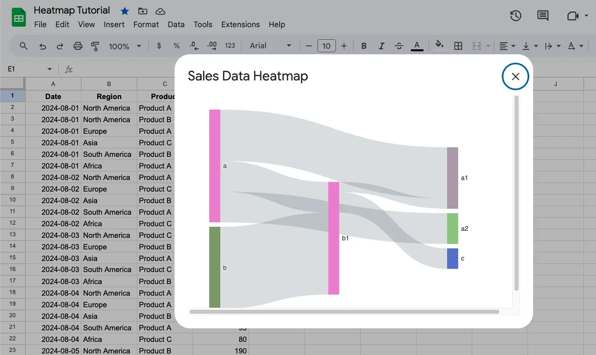
You can try out other chart types by copying the option object from the Echarts examples. Update the option with this to create a Sankey chart:
const option = {
  series: {
    type: 'sankey',
    layout: 'none',
    emphasis: { focus: 'adjacency' },
    data: [
      { name: 'a' },
      { name: 'b' },
      { name: 'a1' },
      { name: 'a2' },
      { name: 'b1' },
      { name: 'c' }
    ],
    links: [
      { source: 'a', target: 'a1', value: 5 },
      { source: 'a', target: 'a2', value: 3 },
      { source: 'b', target: 'b1', value: 8 },
      { source: 'a', target: 'b1', value: 3 },
      { source: 'b1', target: 'a1', value: 1 },
      { source: 'b1', target: 'c', value: 2 }
    ]
  }
};
Ok, so rendering hard-coded charts is easy. Now we need to get the sheet data in the right format for a Heatmap.
Transforming Sheet Data For Heatmap
First, take a look at the option structure for a Heatmap from the Echarts examples.
// prettier-ignore
const hours = [
    '12a', '1a', '2a', '3a', '4a', '5a', '6a',
    '7a', '8a', '9a', '10a', '11a',
    '12p', '1p', '2p', '3p', '4p', '5p',
    '6p', '7p', '8p', '9p', '10p', '11p'
];
// prettier-ignore
const days = [
    'Saturday', 'Friday', 'Thursday',
    'Wednesday', 'Tuesday', 'Monday', 'Sunday'
];
// prettier-ignore
const data = [[0, 0, 5], [0, 1, 1], [0, 2, 0], [0, 3, 0], [0, 4, 0], [0, 5, 0], [0, 6, 0], [0, 7, 0], [0, 8, 0], [0, 9, 0], [0, 10, 0], [0, 11, 2], [0, 12, 4], [0, 13, 1], [0, 14, 1], [0, 15, 3], [0, 16, 4], [0, 17, 6], [0, 18, 4], [0, 19, 4], [0, 20, 3], [0, 21, 3], [0, 22, 2], [0, 23, 5], [1, 0, 7], [1, 1, 0], [1, 2, 0], [1, 3, 0], [1, 4, 0], [1, 5, 0], [1, 6, 0], [1, 7, 0], [1, 8, 0], [1, 9, 0], [1, 10, 5], [1, 11, 2], [1, 12, 2], [1, 13, 6], [1, 14, 9], [1, 15, 11], [1, 16, 6], [1, 17, 7], [1, 18, 8], [1, 19, 12], [1, 20, 5], [1, 21, 5], [1, 22, 7], [1, 23, 2], [2, 0, 1], [2, 1, 1], [2, 2, 0], [2, 3, 0], [2, 4, 0], [2, 5, 0], [2, 6, 0], [2, 7, 0], [2, 8, 0], [2, 9, 0], [2, 10, 3], [2, 11, 2], [2, 12, 1], [2, 13, 9], [2, 14, 8], [2, 15, 10], [2, 16, 6], [2, 17, 5], [2, 18, 5], [2, 19, 5], [2, 20, 7], [2, 21, 4], [2, 22, 2], [2, 23, 4], [3, 0, 7], [3, 1, 3], [3, 2, 0], [3, 3, 0], [3, 4, 0], [3, 5, 0], [3, 6, 0], [3, 7, 0], [3, 8, 1], [3, 9, 0], [3, 10, 5], [3, 11, 4], [3, 12, 7], [3, 13, 14], [3, 14, 13], [3, 15, 12], [3, 16, 9], [3, 17, 5], [3, 18, 5], [3, 19, 10], [3, 20, 6], [3, 21, 4], [3, 22, 4], [3, 23, 1], [4, 0, 1], [4, 1, 3], [4, 2, 0], [4, 3, 0], [4, 4, 0], [4, 5, 1], [4, 6, 0], [4, 7, 0], [4, 8, 0], [4, 9, 2], [4, 10, 4], [4, 11, 4], [4, 12, 2], [4, 13, 4], [4, 14, 4], [4, 15, 14], [4, 16, 12], [4, 17, 1], [4, 18, 8], [4, 19, 5], [4, 20, 3], [4, 21, 7], [4, 22, 3], [4, 23, 0], [5, 0, 2], [5, 1, 1], [5, 2, 0], [5, 3, 3], [5, 4, 0], [5, 5, 0], [5, 6, 0], [5, 7, 0], [5, 8, 2], [5, 9, 0], [5, 10, 4], [5, 11, 1], [5, 12, 5], [5, 13, 10], [5, 14, 5], [5, 15, 7], [5, 16, 11], [5, 17, 6], [5, 18, 0], [5, 19, 5], [5, 20, 3], [5, 21, 4], [5, 22, 2], [5, 23, 0], [6, 0, 1], [6, 1, 0], [6, 2, 0], [6, 3, 0], [6, 4, 0], [6, 5, 0], [6, 6, 0], [6, 7, 0], [6, 8, 0], [6, 9, 0], [6, 10, 1], [6, 11, 0], [6, 12, 2], [6, 13, 1], [6, 14, 3], [6, 15, 4], [6, 16, 0], [6, 17, 0], [6, 18, 0], [6, 19, 0], [6, 20, 1], [6, 21, 2], [6, 22, 2], [6, 23, 6]]
    .map(function (item) {
    return [item[1], item[0], item[2] || '-'];
});
option = {
  tooltip: {
    position: 'top'
  },
  grid: {
    height: '50%',
    top: '10%'
  },
  xAxis: {
    type: 'category',
    data: hours,
    splitArea: {
      show: true
    }
  },
  yAxis: {
    type: 'category',
    data: days,
    splitArea: {
      show: true
    }
  },
  visualMap: {
    min: 0,
    max: 10,
    calculable: true,
    orient: 'horizontal',
    left: 'center',
    bottom: '15%'
  },
  series: [
    {
      name: 'Punch Card',
      type: 'heatmap',
      data: data,
      label: {
        show: true
      },
      emphasis: {
        itemStyle: {
          shadowBlur: 10,
          shadowColor: 'rgba(0, 0, 0, 0.5)'
        }
      }
    }
  ]
}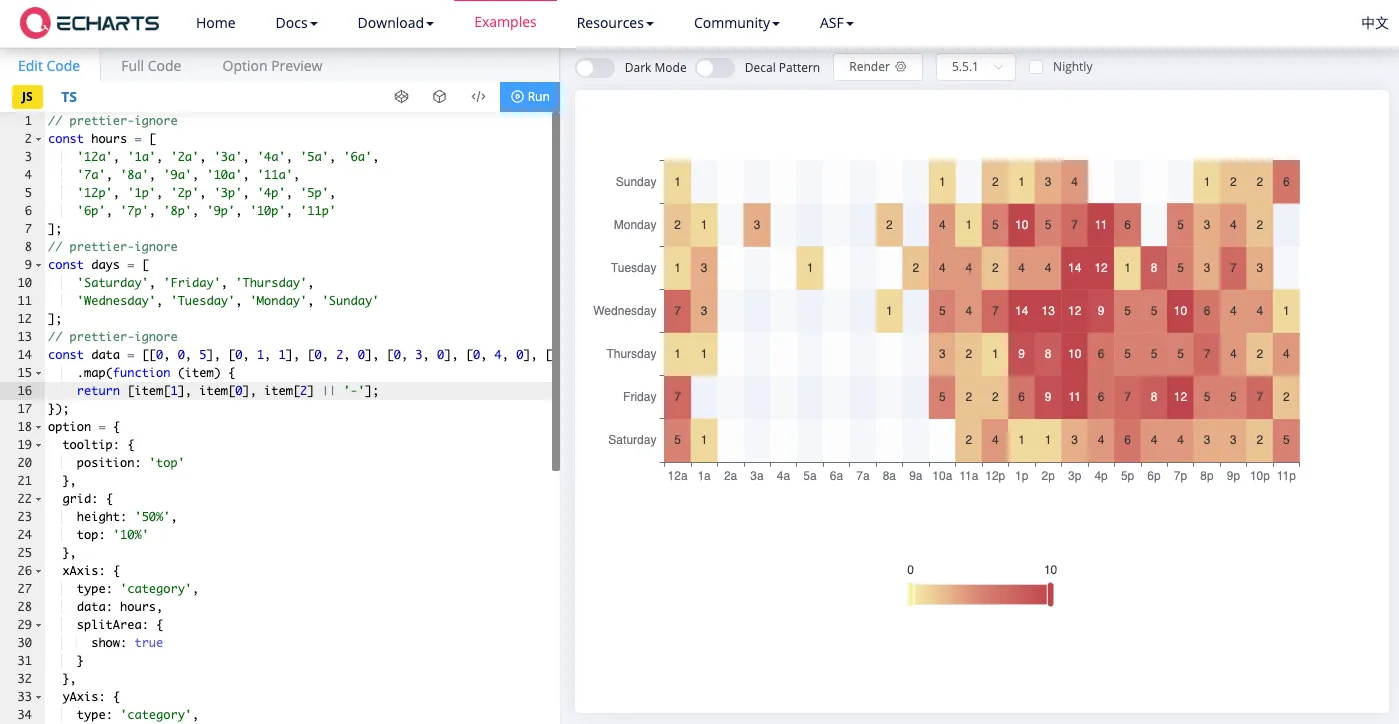
In this example, 3 variables are passed into the option object (hours, days, data), and the rest is hard-coded. We’ll use the same approach, only with our sheet it will be comparing date vs region, with the color coming from the total number of sales for that date.
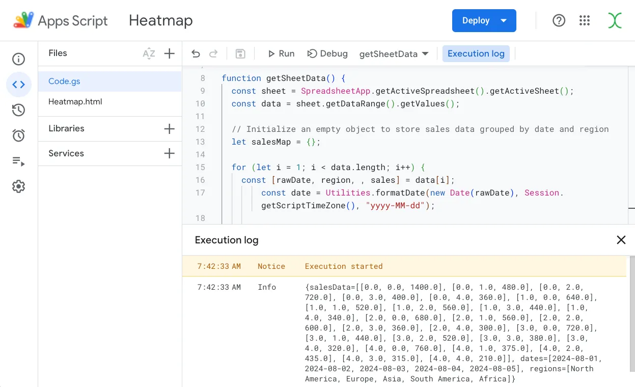
Add a function to the Code.gs file to aggregate the data and return the 3 variables (dates, regions, salesData).
function getSheetData() {
  const sheet = SpreadsheetApp.getActiveSpreadsheet().getActiveSheet();
  const data = sheet.getDataRange().getValues();

  // Initialize an empty object to store sales data grouped by date and region
  let salesMap = {};

  for (let i = 1; i < data.length; i++) {
    const [rawDate, region, , sales] = data[i];
        const date = Utilities.formatDate(new Date(rawDate), Session.getScriptTimeZone(), "yyyy-MM-dd");

    // Initialize the date object and region value, then accumulate totals
    if (!salesMap[date]) salesMap[date] = {};
    if (!salesMap[date][region]) salesMap[date][region] = 0;
    salesMap[date][region] += sales;
  }

  // Extract unique sorted dates and regions
  const dates = Object.keys(salesMap).sort();
  const regions = [...new Set(data.slice(1).map(([ , region]) => region))];

  // Prepare the sales data array for the heatmap, mapping dates and regions to indices
  const salesData = dates.flatMap((date, i) =>
    regions.map((region, j) => [i, j, salesMap[date][region] || 0])
  );

  Logger.log({ dates, regions, salesData });
  return { dates, regions, salesData };
}
Run it and you should get back an object with the 3 variables ready to pass in to the HTML template.
Inserting Sheet Data Into Chart
Lastly, we can use the withSuccessHandler method to retrieve this data from the server, then pass it to a callback function that merges in the variables with an option object for a heatmap.
Here’s how the HTML doc should be structured:
<script>
    function drawChart() {
      google.script.run.withSuccessHandler(({ dates, regions, salesData }) => {
        const chart = echarts.init(document.getElementById('chart'));
        const option = {
          //...
        };
        chart.setOption(option);
      }).getSheetData(); //run getSheetData first, then pass to drawChart
    }
    drawChart();
  </script>
Inserting a Heatmap option object and our variable names, we have:
<!DOCTYPE html>
<html>
<head>
  <script src="https://cdn.jsdelivr.net/npm/[email protected]/dist/echarts.min.js"></script>
</head>
<body>
  <div id="chart" style="width: 600px; height: 400px;"></div>
  <script>
    function drawChart() {
      google.script.run.withSuccessHandler(({ dates, regions, salesData }) => {
        const chart = echarts.init(document.getElementById('chart'));
        const option = {
          tooltip: { position: 'top' },
          grid: {
            height: '50%',
            top: '10%',
            left: '20%',
            right: '10%'
          },
          xAxis: {
            type: 'category',
            data: dates,
            splitArea: { show: true }
          },
          yAxis: {
            type: 'category',
            data: regions,
            splitArea: { show: true }
          },
          visualMap: {
            min: 0,
            max: Math.max(...salesData.map(([ , , value]) => value)),
            calculable: true,
            orient: 'horizontal',
            left: 'center',
            bottom: '15%'
          },
          series: [{
            name: 'Sales Amount',
            type: 'heatmap',
            data: salesData,
            label: { show: true },
            emphasis: {
              itemStyle: {
                shadowBlur: 10,
                shadowColor: 'rgba(0, 0, 0, 0.5)'
              }
            }
          }]
        };
        chart.setOption(option);
      }).getSheetData();
    }
    drawChart();
  </script>
</body>
</html>
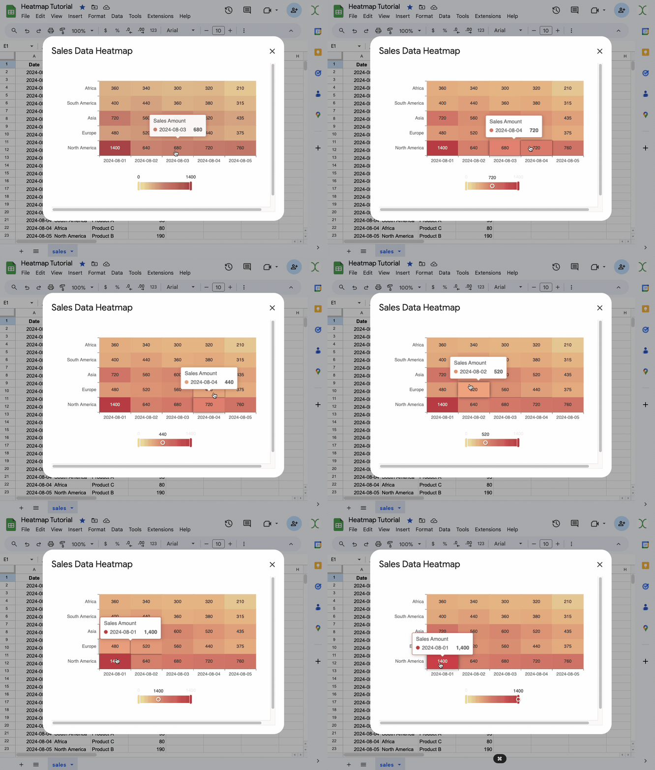
Rerun the createHeatmap script, and you should have an interactive Heatmap, generated from your sheet data!
What’s Next?
There’s a lot more you can do with ECharts, like add animations and click events to the data points. You can also download the charts as images, or even generate PDFs or emails with the charts embedded.
About Me
Hi, I’m Joseph, founder at GreenFlux, LLC and a senior developer advocate at Appsmith. I enjoy pushing the limits of low-code, and I’m always up for a new challenge. If you have an idea for an Apps Script tutorial or need help with Echarts, feel free to drop a comment below and I’ll see what I can do!