Replicating UIs from an Image with Vibe-Coding Tools
Testing UI Reproduction from Multimodal Input in Lovable, Bolt, V0, Claude, and more
Part of the Artificial Intelligence series

Replicating UIs from an Image Using Vibe-Coding
One common complaint of vibe-coding tools is that the UI’s all tend to look the same, unless you go out of your way to provide extra design input. But which ones do best when given the extra instructions?
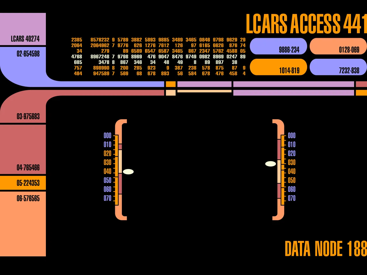
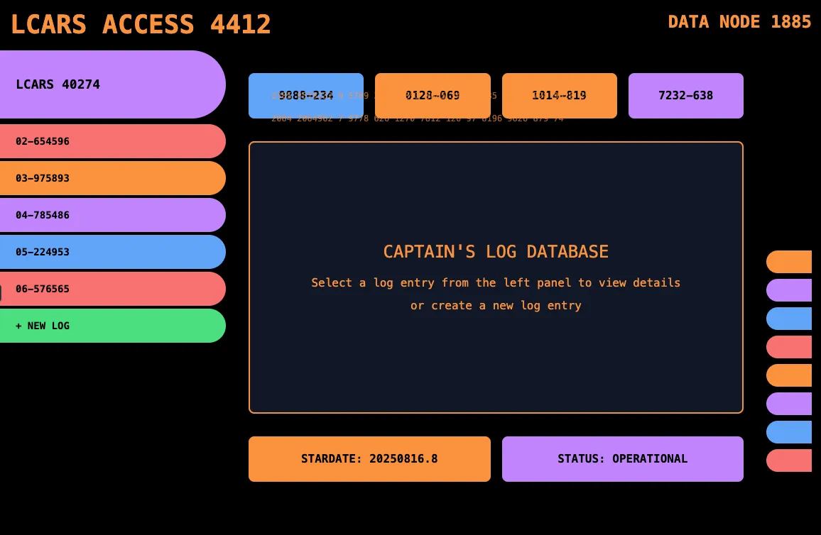
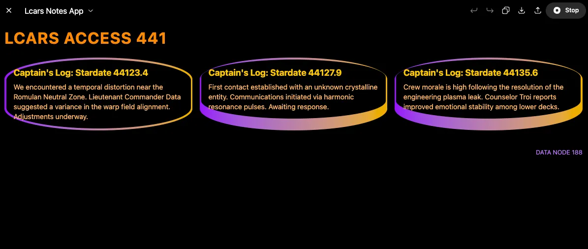
I decided to test multiple tools to see which is best at replicating a bespoke UI from an image. To make the test harder, I wanted to choose a design that would not have a lot of sample code available online for the models to rely on, forcing them to come up with their own approach. And the first UI that came to mind was the LCARS display from Star Trek 🖖
In addition to the image, I gave each tool the same prompt:
Create a star trek themed note taking app that looks like this. Generate mock notes of captain’s logs.
Then I took the same image and had ChatGPT 5 describe it from a design perspective, and added that to the prompt for each vibe-coding tool
Core Visual Style This follows a retro-futuristic computer interface aesthetic, reminiscent of 1980s-90s sci-fi displays (think Star Trek LCARS interface). It features bold, geometric shapes with distinctive rounded corners and a vibrant color palette against a black background. … (continues)
However, I found that the extra text description actually made the results look less like the source image! So I kept it short and only used the first 2 lines, without the extra text to describe the style.
Tools Tested
- Lovable
- Bolt.new
- V0
- Claude Sonnet 4
- Claude Opus 4.1
- ChatGPT 5
- ChatGPT 4o
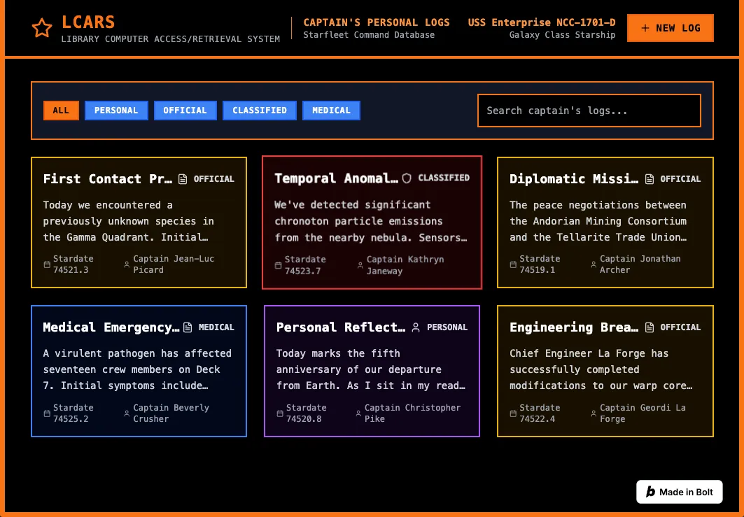
Each tool was given only the image and the one prompt (one shot) to test the ability to reproduce a UI from the image. The functionality of the generated apps were not evaluated. This was solely to test the multi-modal input and it’s effect on output. Below are the results.
Lovable
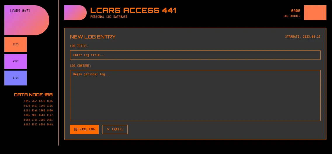 Lovable did a decent job of using the same colors, and the font is similar. It also correctly used upper case for the titles, and made an attempt at the asymmetrical corner radii.
The buttons and DATA NODE 188 section on the left don’t actually do anything. I’m not reviewing functionality with this experiment, but I found it funny that Loveable added extra dummy UI buttons just to match the source image layout, rather than using the image only for the styling.
Bolt.new
 Bolt didn’t really get any of the colors right, and isn’t using upper case as much. The layout is decent for a note taking app but it really doesn’t match the source image at all. There are no rounded corners, no asymmetry, no variation to the border width.
The UI may be functional for a note taking app, but this one seems to have mostly ignored the image input. Other than being dark mode with bold colors, it didn’t take much from the source image at all.
v0
V0 did a pretty good job of choosing colors from the image, but it added gradients when the original image was flat. The font is way off, but it did use upper case for all the headings.
I like how v0 used asymmetric corner radii on the headings and buttons on the left. With a little more prompting, this one might actually look close to the original! But I’m keeping these experiments down to one-shot prompts, because I want to focus more on the image input.
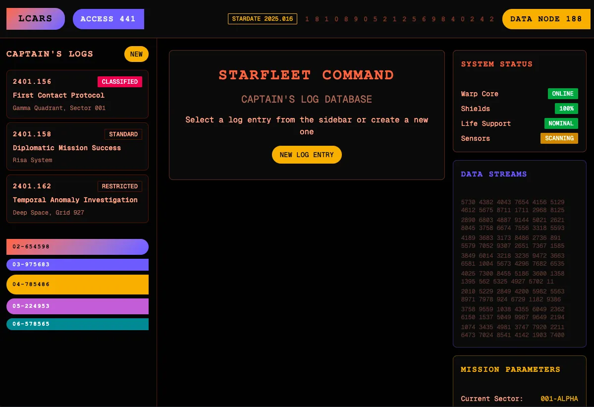
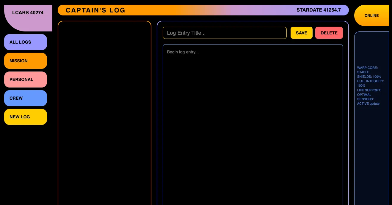
Claude Sonnet 4
 Claude Sonnet 4 got the left sidebar and the colors fairly close. The font and capitalization is also good, but there’s some weird overlapping text in the top.
It’s pretty basic though, and doesn’t show much of an attempt to recreate the smaller details, other than the left sidebar. This one also isn’t great as a note taking interface.
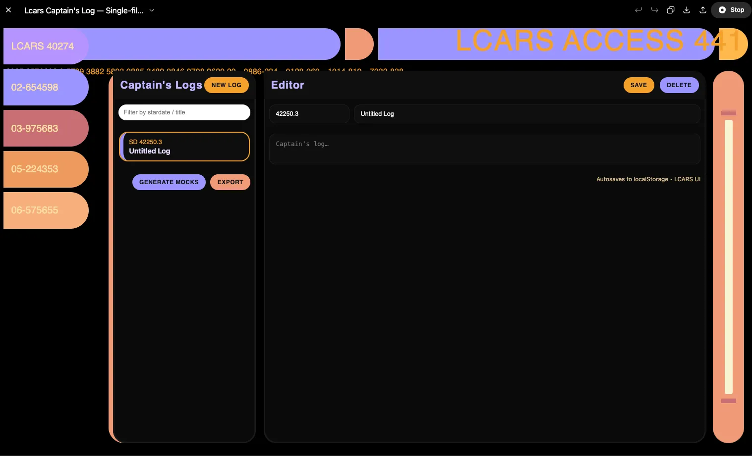
Claude Opus 4.1
Claude Opus 4.1 actually made a container with only one corner radius instead of 2 or all 4, like all the other models that tried to replicate the asymmetric shapes. It also did well on the colors, font and capitalization, but it added a gradient that wasn’t in the source image, just like v0.
This one also had some animated text scrolling in the right pane in a loop. The text moves from the bottom to top, like the credits in Star Wars. I like the different colored borders on each container, even though it doesn’t match the input image.
ChatGPT 5
 Captain, we have a problem! ChatGPT 5 was the only model to have an error and fail to generate a working UI in one shot. Rather than give it a second prompt on the same thread, I started over with another one-shot.
Well, it got the colors right. And it made an orange border on only the left edge of one container, which it a bit more detail than most of the models tried. But there are several issues with overlapping and overflowing text, and the layout isn’t great.
ChatGPT 4o
 Hmm… Not much good I can say about this one. It got a few colors and the all caps in a few places. That’s about it. Nice try GPT 4.1
Results Summary
I’ve decided to score each one in several categories, on a 0-1 scale. For each characteristic, did the LLM make a decent attempt at replicating it?
| Colors | Font | Corner Radius | Arrangement | Casing | TOTAL | |
|---|---|---|---|---|---|---|
| Loveable | ✔︎ | ✔︎ | ✔︎ | ✔︎ | 4 | |
| Bolt.new | 0 | |||||
| v0 | ✔︎ | ✔︎ | 2 | |||
| Claude Sonnet 4 | ✔︎ | ✔︎ | ✔︎ | ✔︎ | 4 | |
| Claude Opus 4.1 | ✔︎ | ✔︎ | ✔︎ | ✔︎ | ✔︎ | 5 |
| ChatGPT 5 | ✔︎ | ✔︎ | ✔︎ | 3 | ||
| ChatGPT 4o | ✔︎ | 1 |
The results? Claude Opus 4.1 was the best model in this test at one-shot replicating a bespoke UI from an image, with no extra design guidelines in the text prompt. That’s not surprising since Anthropic’s models are ranked the highest for coding ability compared to other models.
Other interesting findings were Bolt’s complete disregard of the input image, and ChatGPT 4o’s low performance. But the most interesting part of this experiment was when I removed the extra text description of the LCARS display and the images got better, across all the models! Maybe my (ChatGPT 5’s) description of the image was off, but all the models seemed to do better when only given the image, without extra design guidance in text.
Conclusion
This was only a single test on each model, only a one-shot attempt, and there are lots of other tools I could have included. But it was still quite interesting to see the wide range of performance between models when given the same input image and minimal text prompting.
Is this content interesting and valuable? It’s not nearly as technical as most of my posts, but it was a fun experiment. Should I do a larger study? Multiple images? Wider scoring range? Let me know if you’d like to see more content like this!